Bar sweep analysis
Stimulus overview
The bar sweep stimulus consists of a 4 pixel wide bar that moves across the 30 x 30 pixel stimulus area. The bar is presented in 8 orientations, moving in both the forward and reverse direction for each orientation (16 directions total). Multiple speeds are used depending on the protocol version.

Breakdown of process_bars_p2
function resultant_angle = process_bars_p2(exp_folder, metadata, PROJECT_ROOT)This function processes the bar sweep responses from Protocol 2. It returns resultant_angle — the preferred direction (in radians) from the slow bar sweeps — which is passed to the flash analysis as an input.
Loading the data
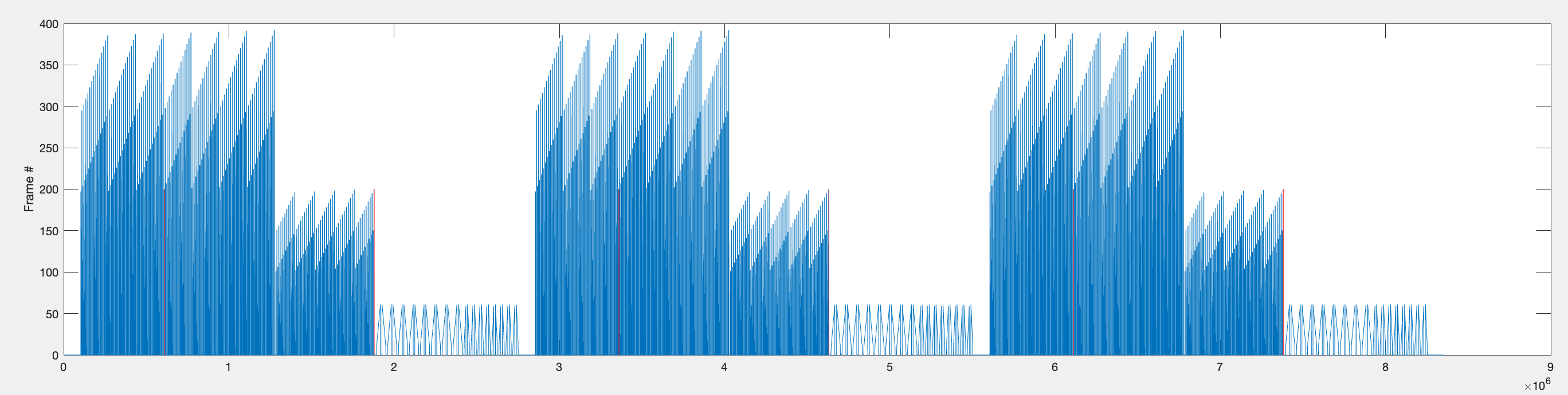
The frame position and voltage data are loaded from the experiment’s Log file:
f_data = Log.ADC.Volts(1, :); % frame data
v_data = Log.ADC.Volts(2, :)*10; % voltage data
This is the data across the entire experiment — all repetitions of the flash stimuli, bar sweeps, and bar flashes. The voltage data is multiplied by 10 because the acquisition hardware divides the voltage by a factor of 10 to fit within the ADC input range. The median voltage across the full recording is also calculated as a baseline reference.
Parsing the bar data
The function parse_bar_data extracts the bar sweep responses from the full recording. It uses the frame position data to identify when bar stimuli were presented.
Step 1 — Find the repetition boundaries.
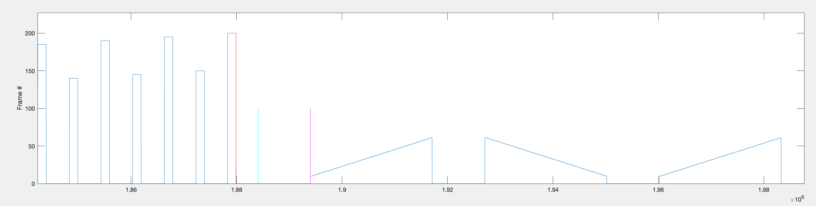
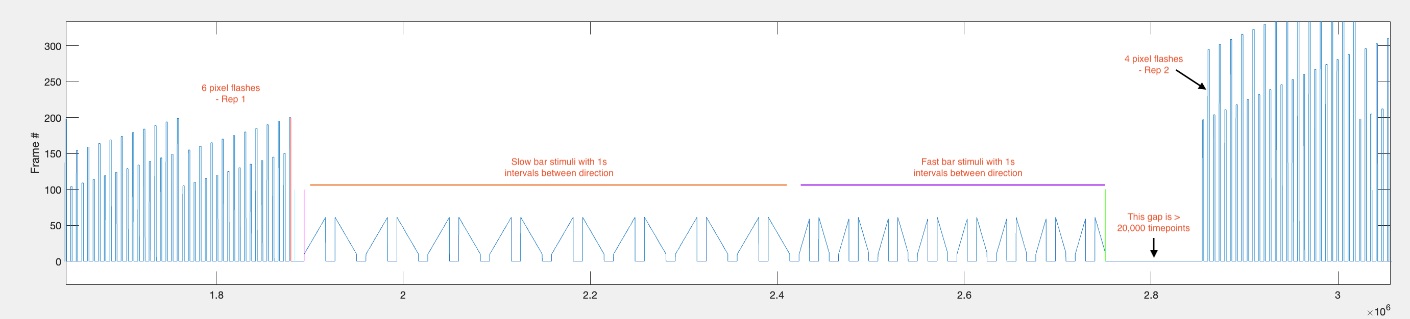
Using the on_off parameter (whether bright or dark stimuli were used), the parser identifies large drops in frame position that occur at the end of each flash stimulus block. These act as landmarks for locating the bar sweep data within each repetition.
idx = find(diff_f_data == drop_at_end);
idx([1,3,5]) = [];
The remaining indices in idx correspond to the end of the 6 pixel flash blocks — the stimulus immediately before the bar sweeps begin.
Since each flash has a 440ms interval and each bar sweep is preceded by a 1000ms gap, there is approximately 1440ms between the last flash and the first bar sweep.
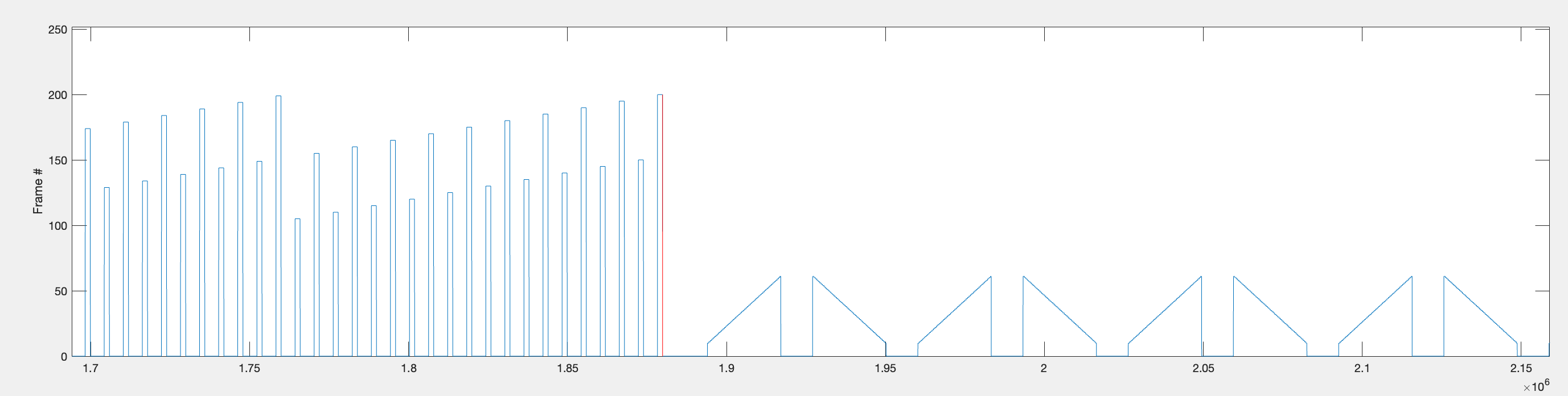
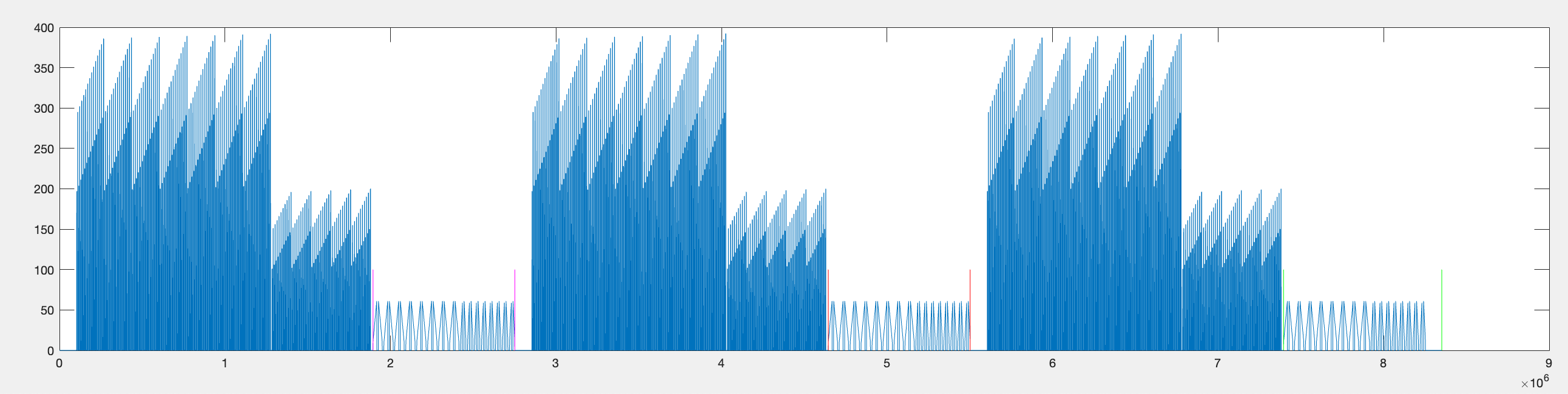
The start and end timepoints for all bar stimuli within each repetition are found and stored as rep1_rng, rep2_rng, and rep3_rng.
Step 2 — Find start/stop of each individual bar sweep.
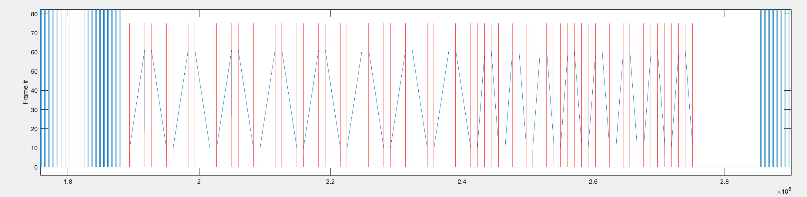
Within each repetition range, the function identifies individual bar sweeps by looking for large jumps in frame position (absolute difference > 9). This threshold works because bars first appear around frame 10, so the transition from the background frame (frame 1) to the bar frame produces a jump of > 9.
Step 3 — Extract voltage data per sweep into a cell array.
The indices from step 2 are used to extract voltage data for each bar sweep. A 900ms context window is added before and after each sweep to capture the baseline. The data is assembled into a [32 x 4] cell array called data:
| Rows | Content | Approximate timepoints per cell |
|---|---|---|
| 1–16 | Slow bar sweeps (16 directions) | ~41,100 (0.9s + 2.3s + 0.9s at 10 kHz) |
| 17–32 | Fast bar sweeps (16 directions) | ~29,100 (0.9s + 1.1s + 0.9s at 10 kHz) |
Columns 1–3 contain individual repetitions; column 4 contains the mean across repetitions (after trimming to the shortest repetition length).
Plotting the bar data
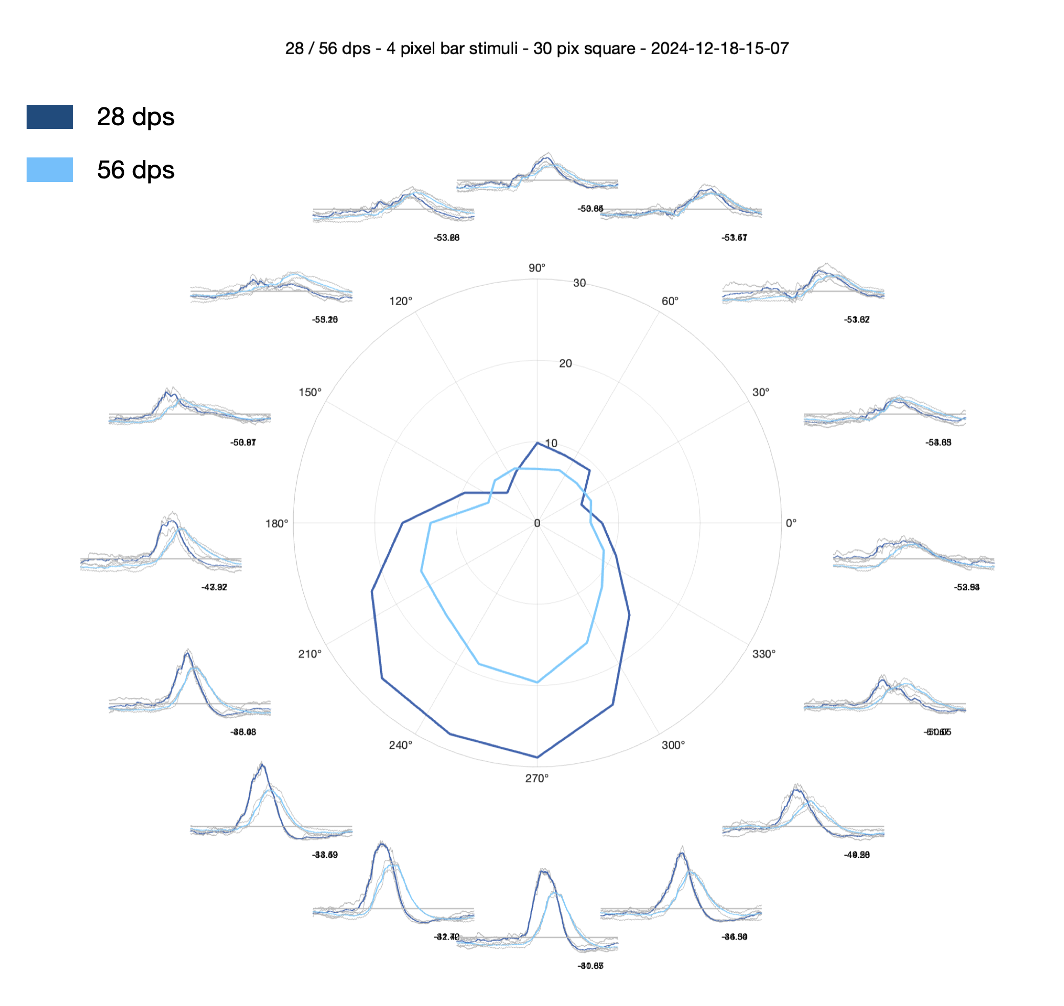
1. Circular timeseries with central polar plot — plot_timeseries_polar_bars
This function creates a circular arrangement of 16 timeseries subplots, one per direction. Each subplot shows individual repetitions in light grey and the mean response in blue (dark blue for slow, light blue for fast bars). The 900ms context windows are visible either side of each sweep, with thin vertical black lines marking their boundaries.
A polar plot in the centre of the figure shows the directional tuning. To generate the polar values:
- The mean response for each direction is trimmed to exclude the 0.9s pre-stimulus interval and the last 0.7s of the post-stimulus interval.
- The 98th percentile of this trimmed voltage is taken as
max_v(peak response). - The 2nd percentile of the second half of the trimmed data is taken as
min_v. - The median voltage across the full recording is subtracted from these values.
The function returns max_v and min_v as [16 x n_speeds] arrays.
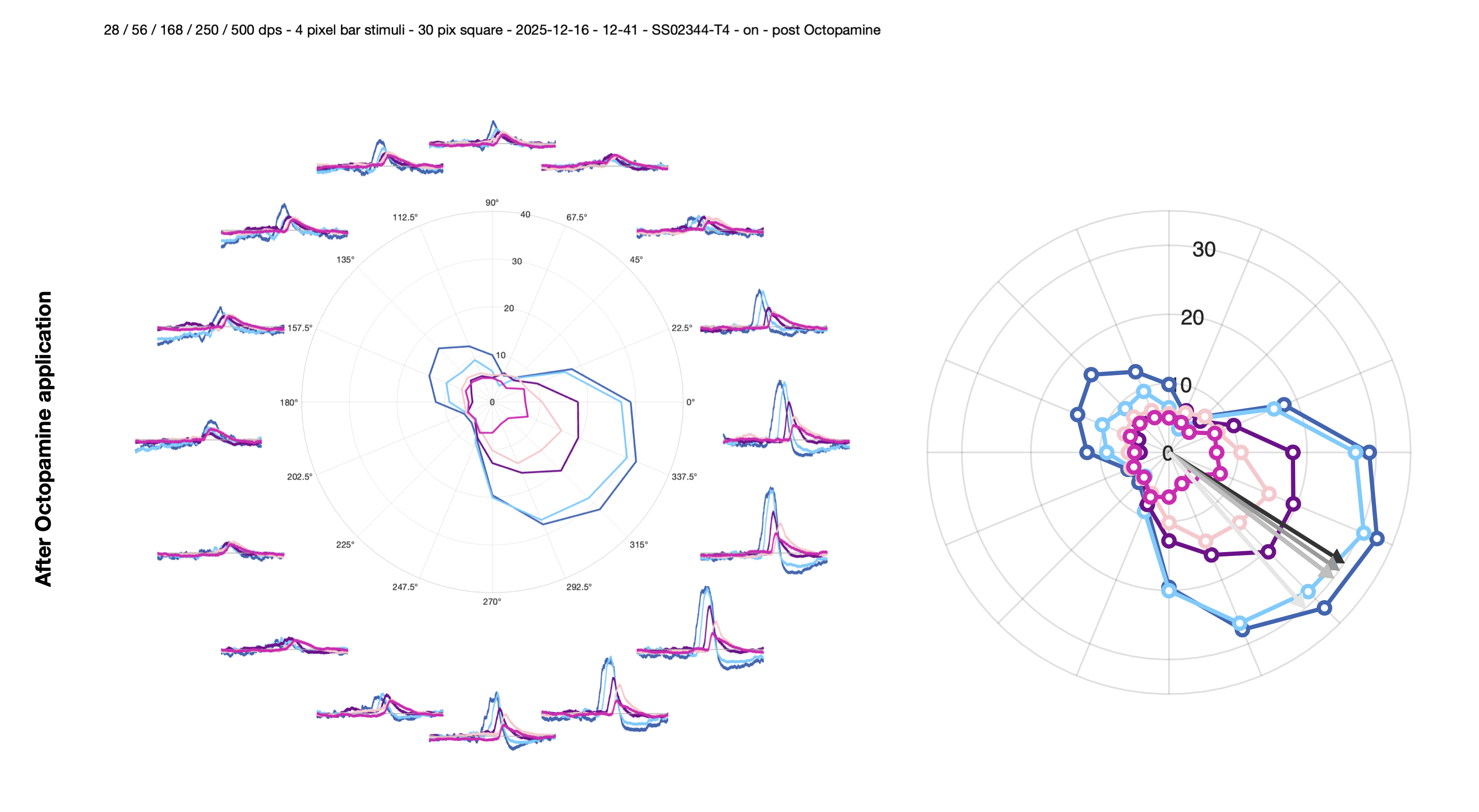
2. Polar plot with vector sum arrow — plot_polar_with_arrow
Plots the polar data with an arrow indicating the preferred direction. Calls vector_sum_polar to compute the resultant angle, then add_arrow_to_polarplot to overlay the direction indicator. The arrow magnitude is fixed at 30 (matching the default rlim of [0, 30] which fits most data).
3. Heatmap of peak responses — plot_heatmap_bars
Produces a heatmap of the max_v values per direction and speed.
Calculating metrics from the bar data
The bar responses are further processed to quantify direction selectivity. All metrics are calculated for each speed condition.
1. Reorder by sequential angles — align_data_by_seq_angles
The data cell array is initially ordered by stimulus presentation order (forward/reverse pairs per orientation). This function reorders the rows so they correspond to sequential angles (0, π/8, 2π/8, …, 15π/8).
2. Find preferred direction and align to π/2 — find_PD_and_order_idx
This function computes the preferred direction via vector sum and circularly shifts the data so the PD is always positioned at π/2 (top of polar plot). It also computes:
Circular variance (CV): \[CV = 1 - \frac{|\sum r_i \cdot e^{i\theta_i}|}{\sum r_i}\] Range 0–1. CV = 0 means sharp tuning (all response in one direction); CV = 1 means broad/uniform tuning.
FWHM (via
compute_FWHM): the angular width (in degrees) at which the response drops to half the peak value.Von Mises parameters (via
circ_vmparfrom the Circular Statistics Toolbox):thetahat(mean direction) andkappa(concentration — higher values = sharper tuning).
3. Compute response metrics — compute_bar_response_metrics
This function calculates three additional metrics from the PD-aligned data:
Symmetry ratio: compares response magnitudes at paired angles equidistant from the PD (e.g. PD ± π/8, PD ± 2π/8, …). Formula:
sym_ratio = 1 - (Σ|diff_pairs| / Σ_all_responses). Range 0–1, where 1 = perfectly symmetric tuning curve.DSI (vector sum method): \[DSI_{vector} = \frac{|\sum r_i \cdot e^{i\theta_i}|}{\sum r_i}\] Range 0–1. Equivalent to
1 - CV.DSI (PD-ND method): \[DSI_{PD-ND} = \frac{R_{PD} - R_{ND}}{R_{PD} + R_{ND}}\] Where RPD is the response in the preferred direction and RND is the response in the opposite (null) direction. Range -1 to 1.
Saved outputs
All metrics are stored in a structure bar_results and saved as peak_vals_<strain>_<on_off>_<date>_<time>.mat in the results folder. The structure contains:
| Field | Description |
|---|---|
bar_results.slow/fast/vfast.magnitude |
Normalised vector sum magnitude (0–1) |
bar_results.slow/fast/vfast.angle_rad |
Preferred direction (radians) |
bar_results.slow/fast/vfast.fwhm |
Full-width half-maximum (degrees) |
bar_results.slow/fast/vfast.cv |
Circular variance |
bar_results.slow/fast/vfast.thetahat |
Von Mises mean direction |
bar_results.slow/fast/vfast.kappa |
Von Mises concentration parameter |
bar_results.slow/fast/vfast.sym_ratio |
Symmetry ratio |
bar_results.slow/fast/vfast.vector_sum |
Complex vector sum |
bar_results.slow/fast/vfast.DSI_vector |
Direction selectivity index (vector method) |
bar_results.slow/fast/vfast.DSI_pdnd |
Direction selectivity index (PD-ND method) |
bar_results.slow/fast/vfast.max_v_polar |
Peak response per direction |
bar_results.median_voltage |
Baseline voltage (median across recording) |
bar_results.resultant_angle |
PD from slow bars (function output) |
Additional saved variables include data (raw cell array), data_aligned (PD-aligned), ord (reordering indices), and d_slow/d_fast/d_vfast (median-subtracted peak responses per direction, circularly shifted so that the PD is at the π/2 position).