Dashboard
The interactive Dash web dashboard provides a browser-based interface for exploring processed experimental data from the freely-walking optomotor experiments. It is built with Plotly Dash and Dash Bootstrap Components.
What the dashboard shows
The dashboard allows you to:
- Select a protocol results directory and browse all strains and conditions within it
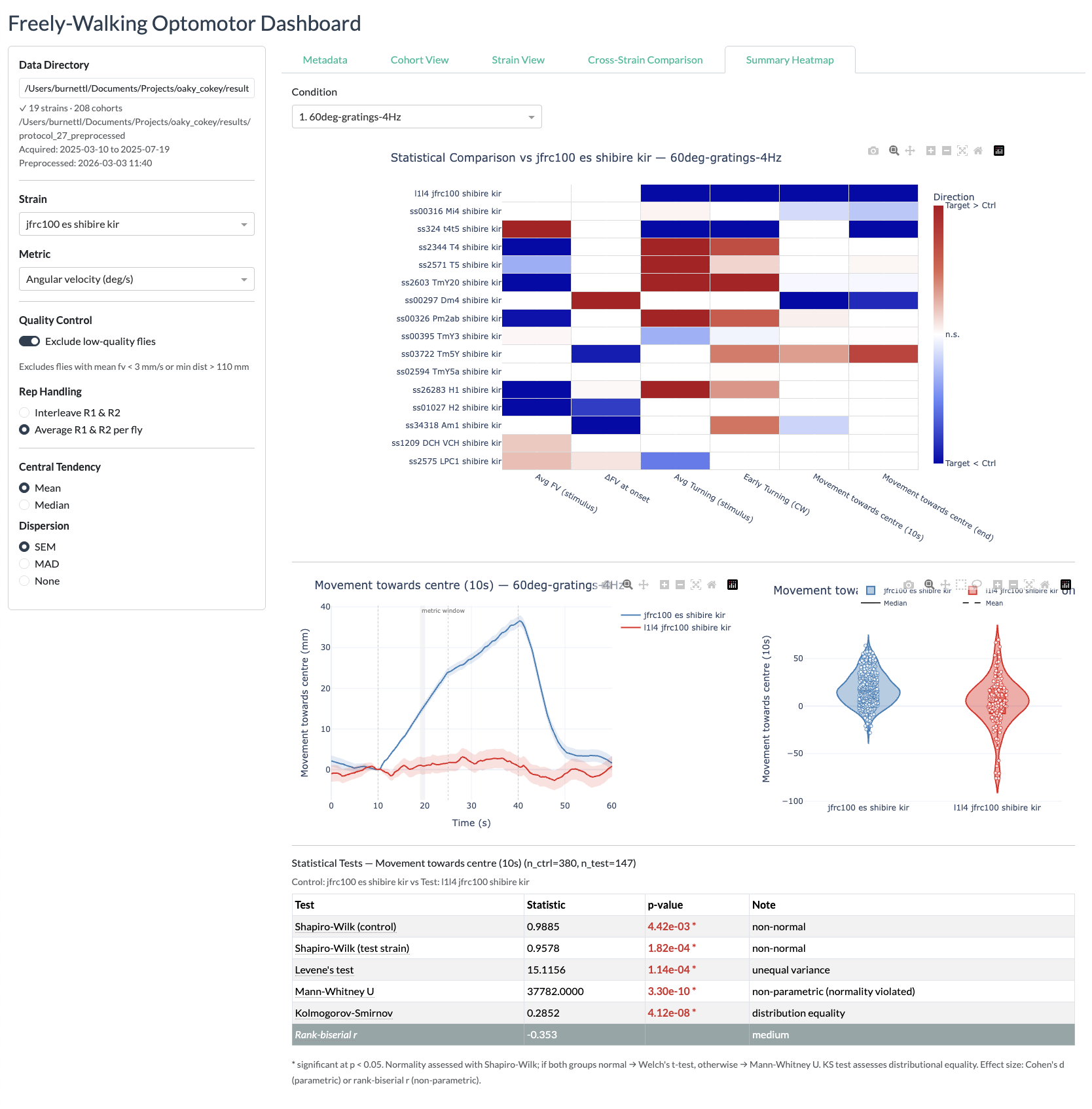
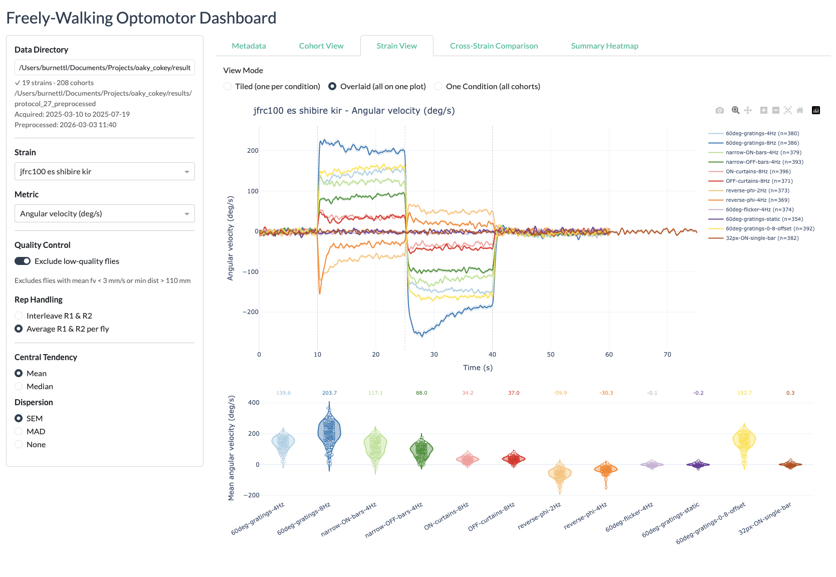
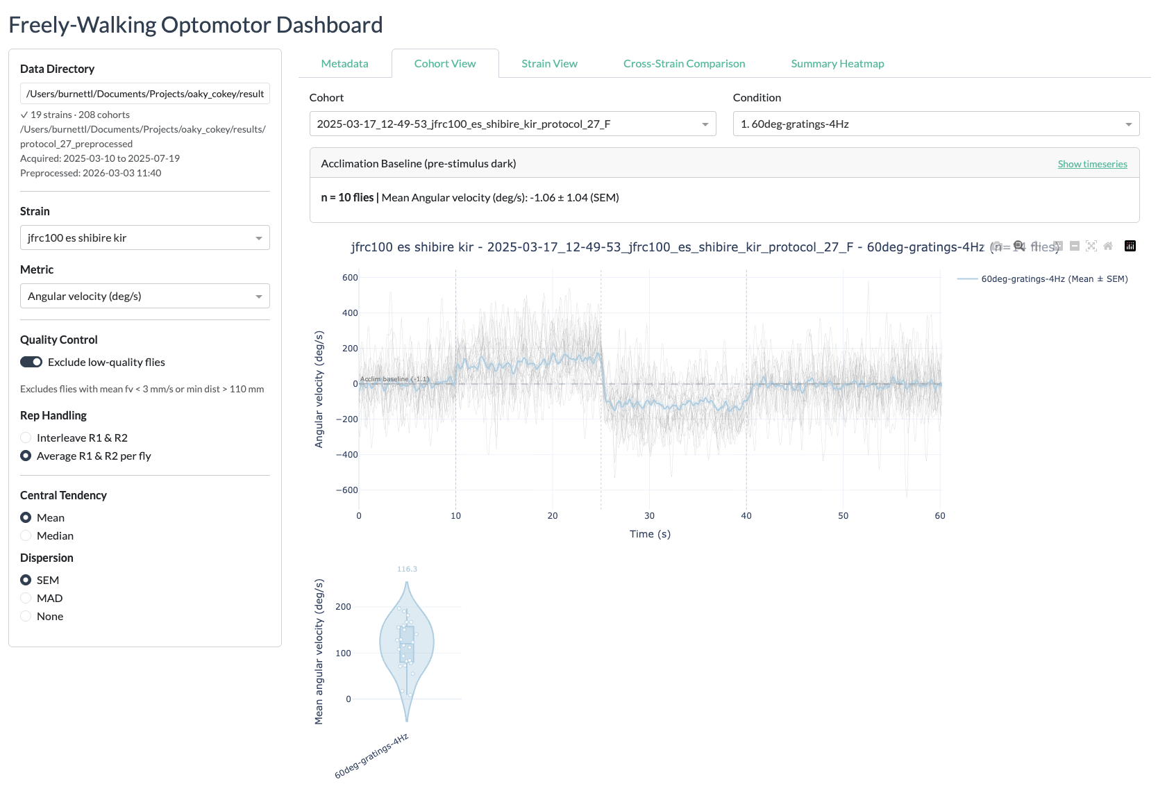
- View timeseries plots of behavioural metrics (forward velocity, angular velocity, turning rate, distance from centre, distance delta) for any strain vs. the empty-split control
- Compare responses across conditions in an interactive subplot layout
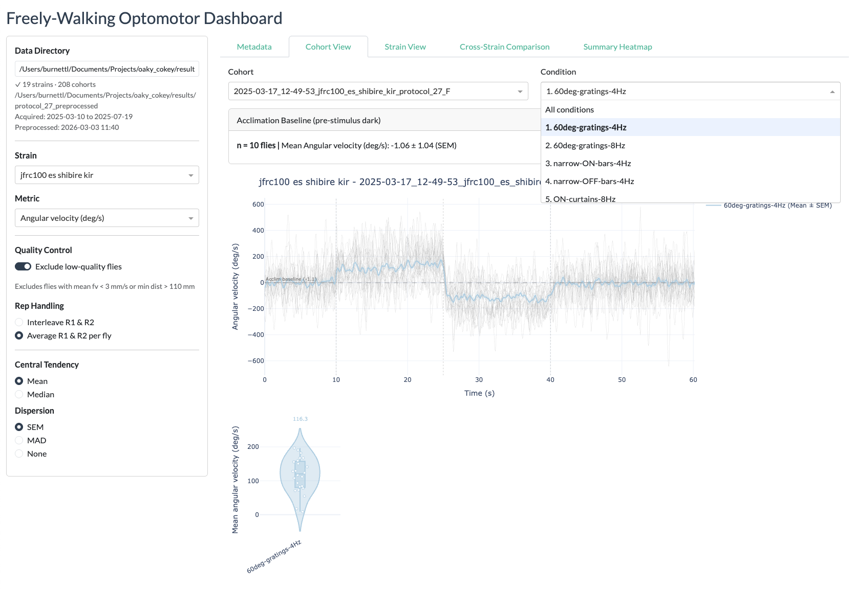
- Switch between metrics, strains, and conditions using sidebar controls
- View cohort-level statistics (number of vials, number of flies per strain)
Prerequisites
The dashboard requires:
- The freely-walking-optomotor repository cloned locally
- The pixi package manager installed (pixi.sh)
- Processed result
.matfiles fromprocess_freely_walking_data(see Analysis)
How to start the dashboard
Option 1: Shell alias (recommended)
Set up the dash-freely alias by adding this line to ~/.zshrc (or ~/.bashrc):
alias dash-freely='~/Documents/GitHub/freely-walking-optomotor/dashboard.sh'Then from anywhere in the terminal:
dash-freely              # start the dashboard (opens http://localhost:8050)
dash-freely preprocess   # preprocess .mat files to Parquet first
Option 2: Run directly with pixi
cd python/freely-walking-python
pixi run preprocess    # convert .mat files to Parquet (required on first use or after new data)
pixi run dashboard     # start the Dash app on http://localhost:8050
The dashboard will open automatically in your default browser once the server is ready.
Preprocessing
Before using the dashboard for the first time (or after new data has been processed), you need to convert the MATLAB .mat result files to Parquet format for fast loading:
dash-freely preprocess
# or: cd python/freely-walking-python && pixi run preprocess
This reads all *_data.mat files from the results directory and writes Parquet files to a _preprocessed subdirectory alongside the original data. The preprocessing step only needs to be repeated when new experiment data has been processed.
How the dashboard works
The dashboard is built from several modules in python/freely-walking-python/dashboard/:
| Module | Purpose |
|---|---|
app.py |
Main Dash application layout (sidebar, content area, controls) |
callbacks.py |
Interactive callback functions that update plots when selections change |
data_loader.py |
DataStore class that loads Parquet data and provides strain/condition lookups |
preprocess.py |
Converts .mat result files to Parquet format |
processing.py |
Data processing utilities for the dashboard |
cohort_stats.py |
Computes per-strain cohort and fly count statistics |
heatmap.py |
Heatmap visualisation components |
constants.py |
Shared constants (metric names, condition labels, default paths) |
On startup, the dashboard pre-loads all strain data into memory for fast interactive use. This means startup takes approximately 20–30 seconds, but subsequent interactions are near-instant.
Using the dashboard
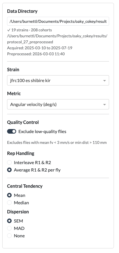
- Set the data directory — The sidebar shows a text input for the path to the protocol results folder (e.g. the
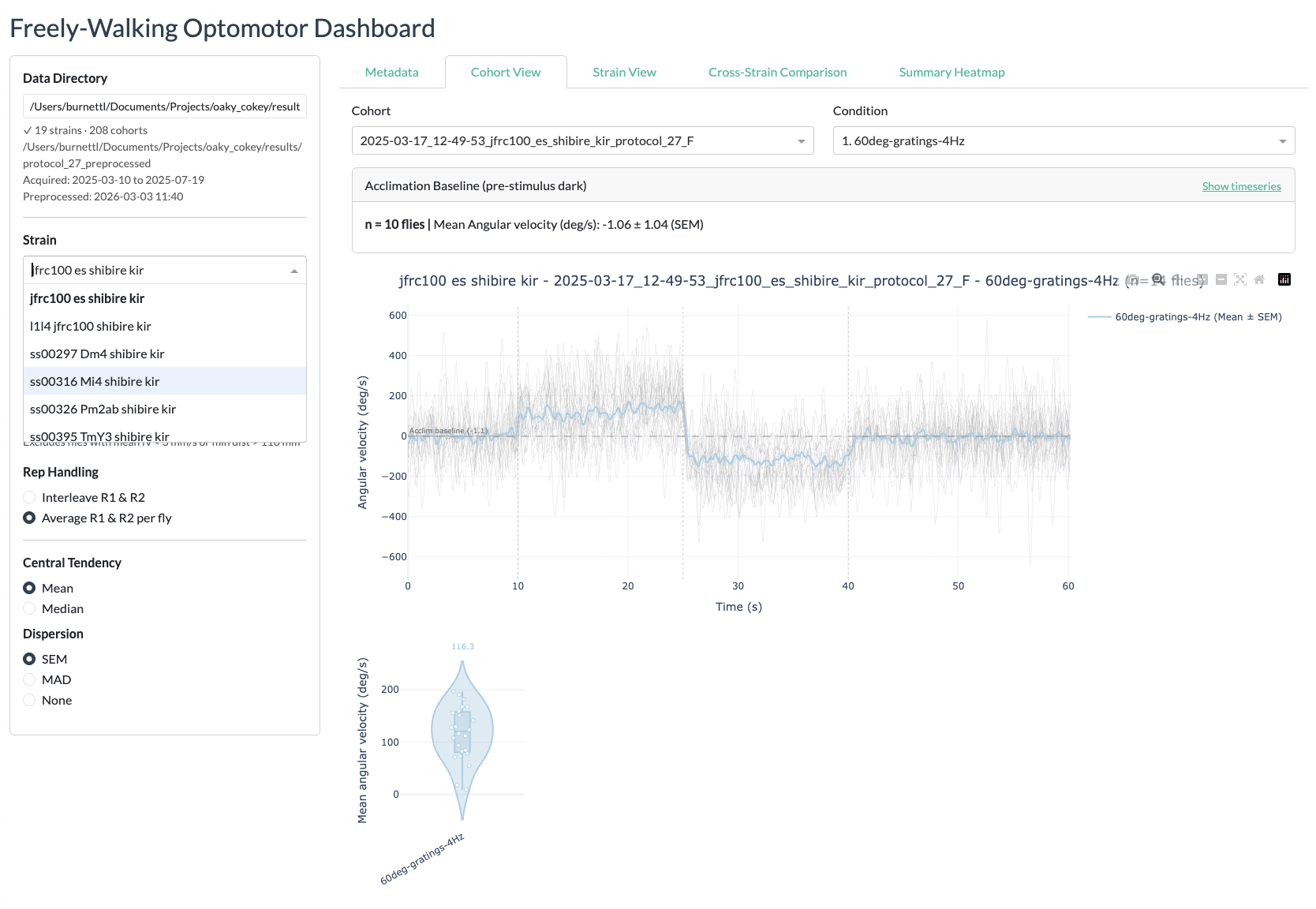
protocol_27results directory). The default path is read from the configuration. - Select a strain — Choose from the dropdown list of available strains.
- Select a metric — Choose the behavioural metric to plot (forward velocity, angular velocity, turning rate, distance from centre, or distance delta).
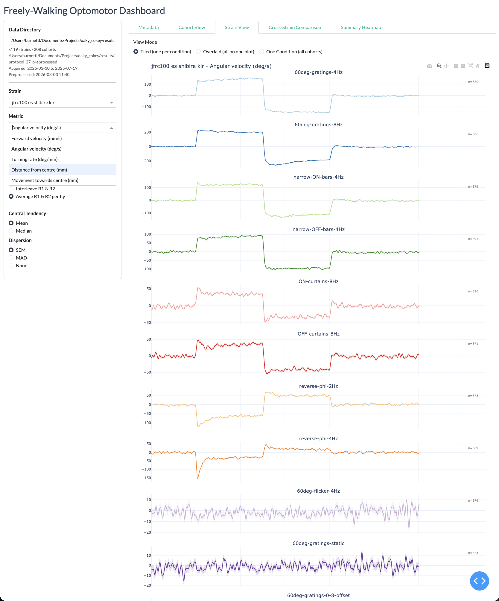
- Browse conditions — The main panel displays timeseries subplots for each condition, showing the selected strain against the empty-split control with mean and SEM shading.
Metadata and navigation
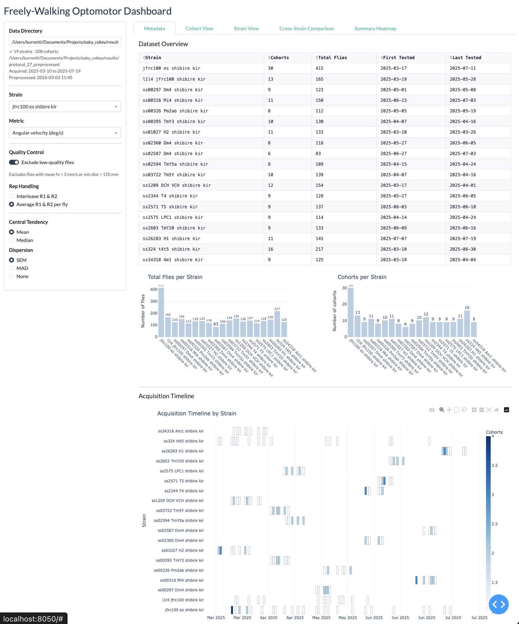
Cohort View
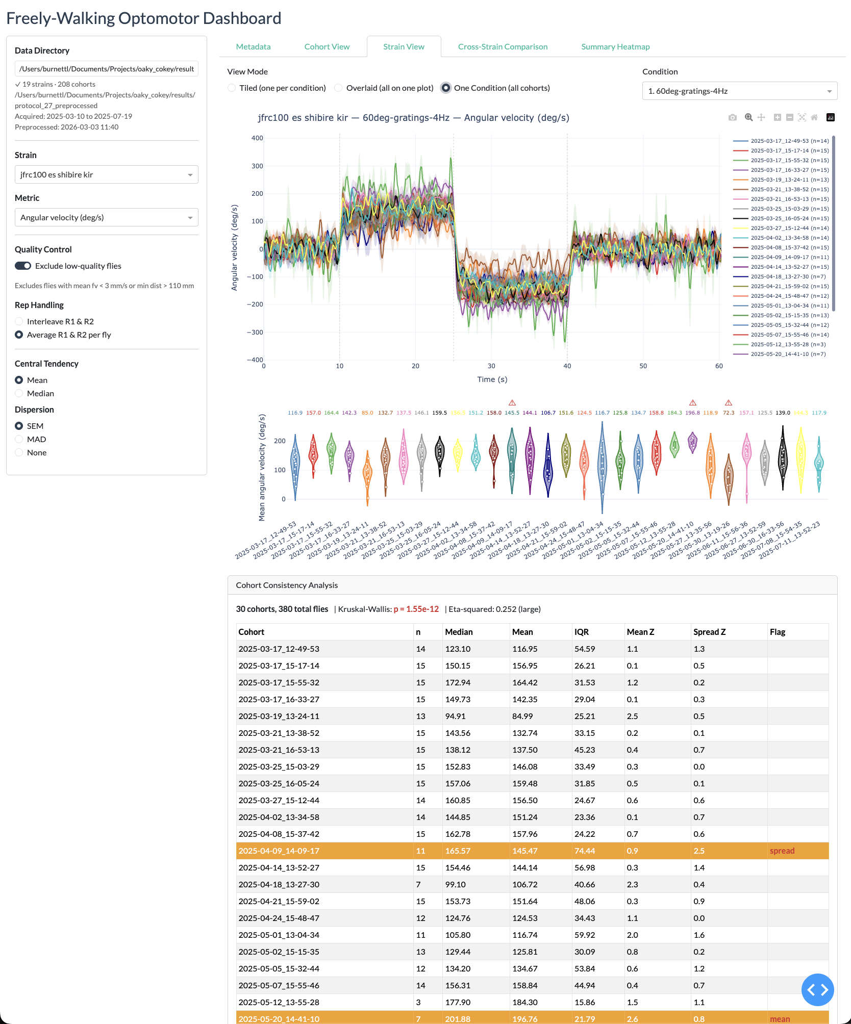
Strain view
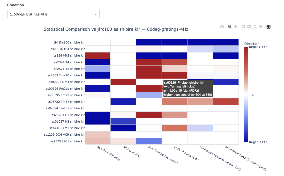
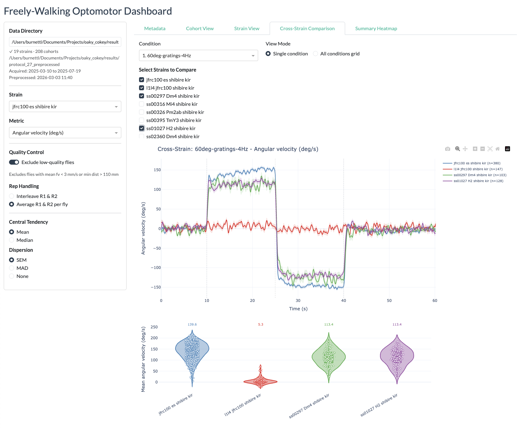
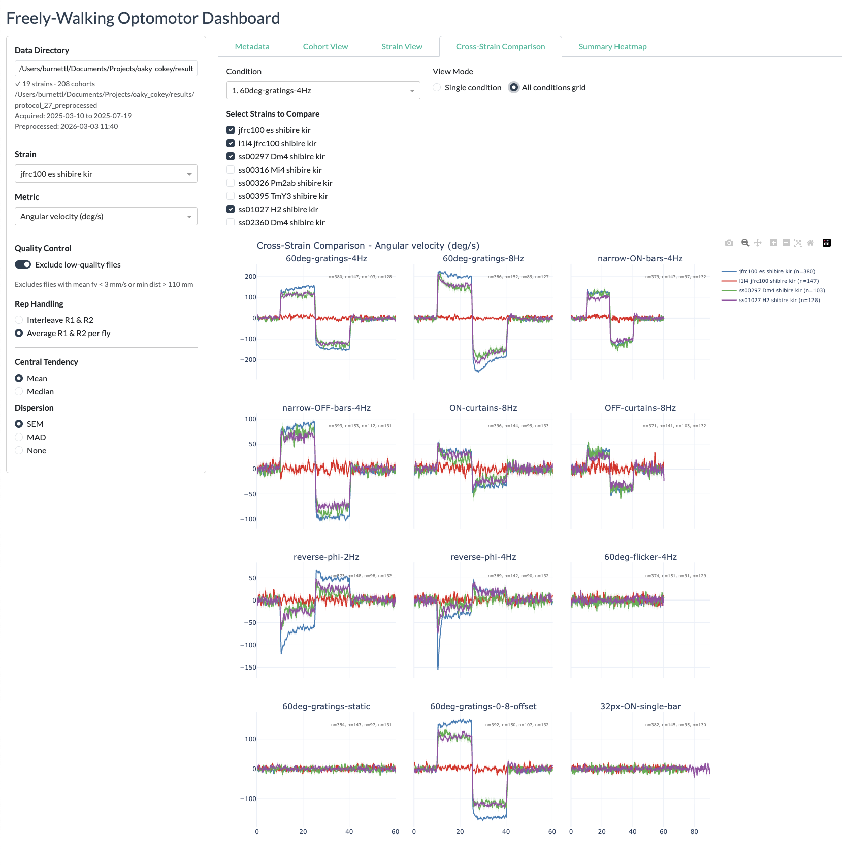
Cross-strain view
Summary heatmaps