Connectome Cell Type Explorer
Python CLI to generate an interactive web resource from a connectome dataset

Highlights
- Co-built the modular Python CLI generator neuView that creates the Cell Type Explorer web resource, extending it from the optic lobe to the whole 164,838-neuron male CNS connectome.
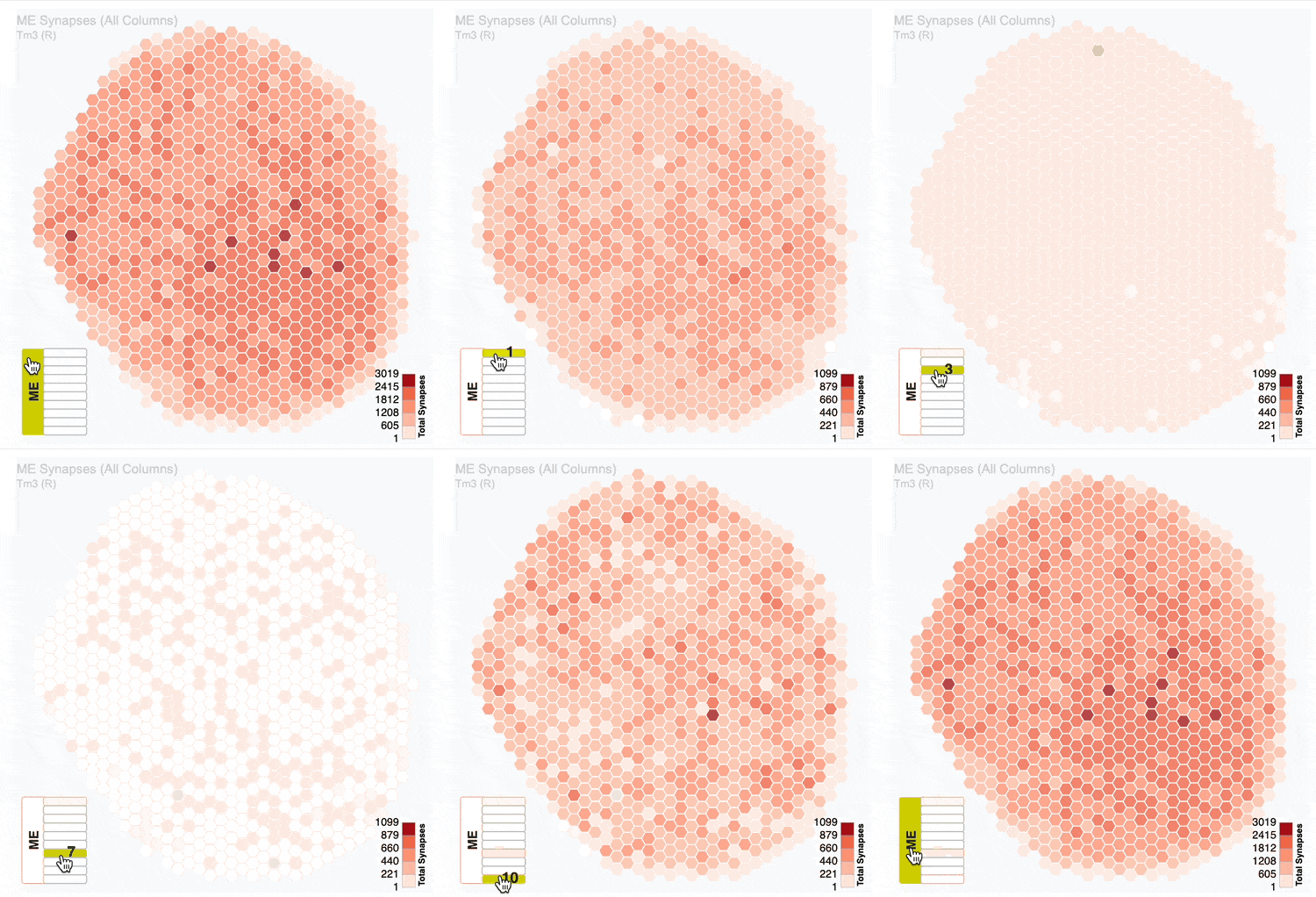
- Built interactive plots, such as downloadable hexagonal SVG eyemaps.
- Generalised the pipeline to build a similar resource from any neuPrint dataset.
- Set up CI on GitHub Actions: unit and integration test suites, coverage reporting, and Ruff linting on every push.
Background
As I describe on the connectome project page, connectomes are extraordinary resources — and they are released to the public at the finest possible grain. The dataset I worked on, like the others before it, is published as a database in which every neuron and every synapse carries its own ID, so anyone can query a single cell or a single connection.
That granularity is the point of a connectome. It is not, however, the level at which most fly experiments happen.
One of the great advantages of working with Drosophila melanogaster is its genetic tractability: experimenters use genetically modified flies carrying constructs that label or manipulate a specific population of cells. The unit of an experiment is therefore usually a cell type rather than a cell. Much of the work behind Nern et al. 2025 was exactly this — sorting the >50,000 cells of the visual system into types — so it seemed worth building a resource that handed that information back, pre-packaged, at the level people would actually want to use it.
Problem
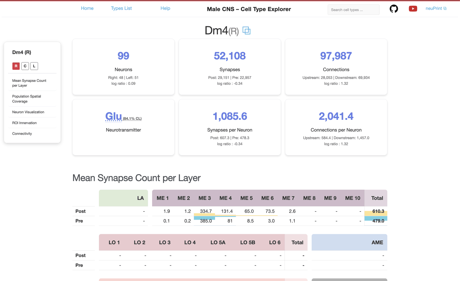
Give experimenters and students population-level answers from the connectome — morphology, connectivity, synapse counts, spatial coverage — without asking them to write a single Cypher or neuPrint query, and do it for every cell type in the dataset.
Methods
The first version of the Cell Type Explorer, released alongside Nern et al. 2025, covered only the optic lobe. After that paper was published, Frank Loesche and I were asked to extend it to the >100,000 remaining neurons of the whole male central nervous system (Berg et al. 2026).
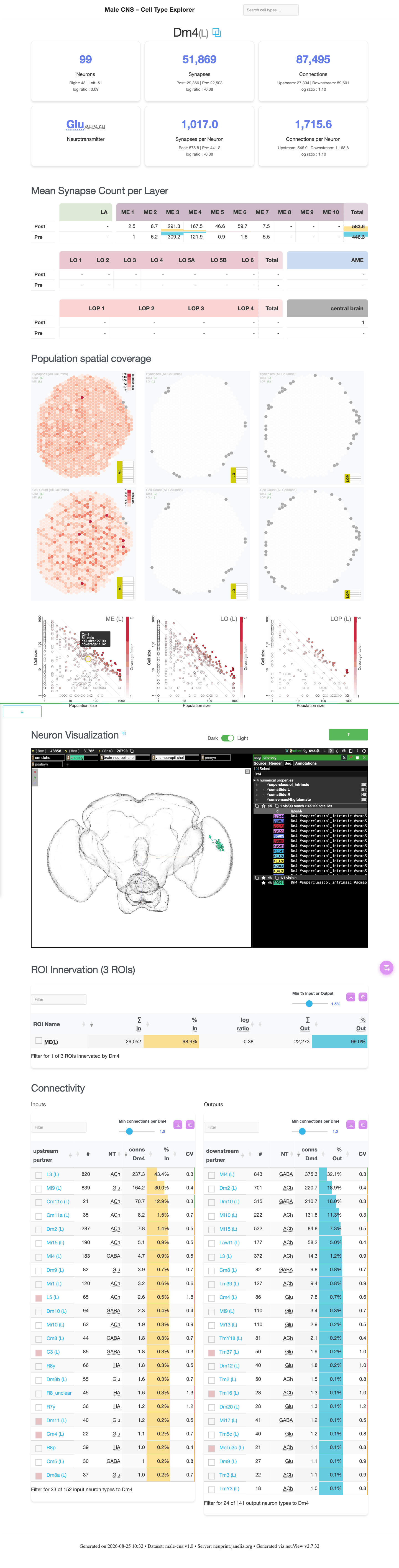
Those cells broke most of the assumptions built into the original pipeline. It produced a great many metrics and plots that only mean something in the visual system. So, rather than special-case our way outwards, we rewrote the code behind the resource entirely. The result is a modular, service-oriented codebase in which each page is assembled from only the analyses that a given cell type, in a given dataset, can actually support.
The rewrite paid for itself in build times as much as in tidiness. Pages are now generated from a file-based work queue, so a whole dataset can be built in parallel across processes, and a persistent caching layer that Frank added brought repeat builds down by up to 97%. Between them, those two changes turned regenerating the resource from an overnight job into something we could do while still working on it.
The spatial coverage maps are drawn from scratch: hand-built hexagonal grids rendered as SVG through Jinja2 templates, with their own coordinate system and colour mapping, and offered to the reader as a downloadable SVG or PNG.
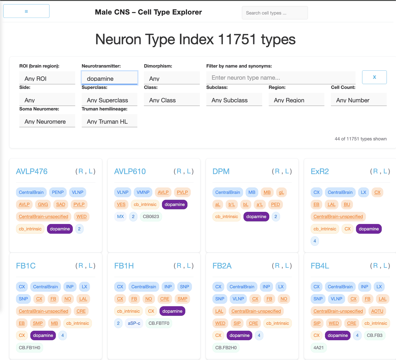
We rebuilt the resource around it too. There is now a documentation “Help” page, a far more capable search index across every type, and a proper treatment of the fact that a type’s cells may sit in the left hemisphere, the right, or on the midline — each type gets its own page per side as well as a combined one.
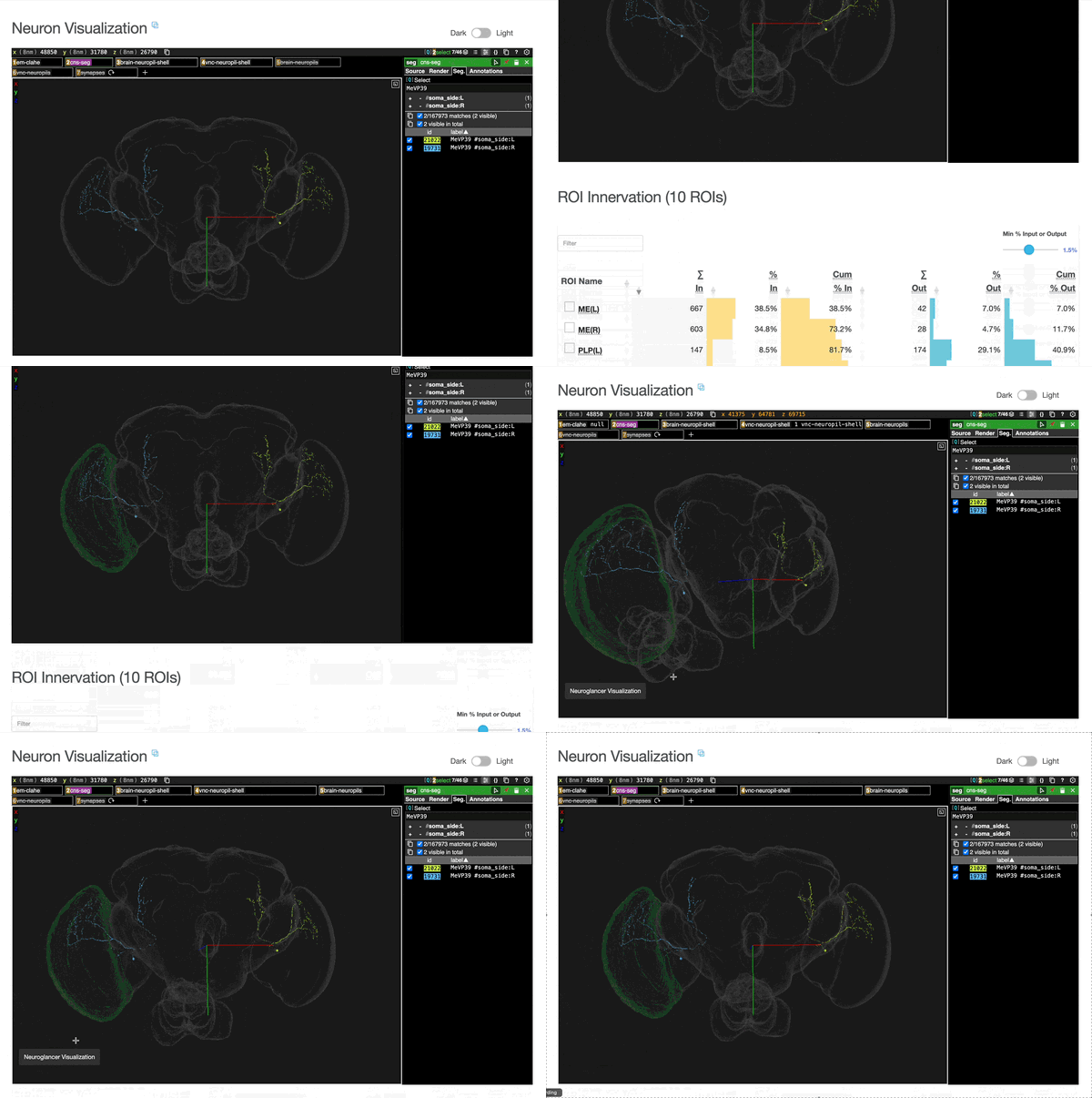
One of my favourite features that I added was the addition of interactivity to the embedded Neuroglancer view on each page. The user can select a partner from the connectivity table and it appears in 3D alongside the cell type. Similarly, a spatial regions of interest (ROIs) can also be visualised within the 3D view by selecting the region within the ROI Innervation table.
Outcome
neuView is a Python CLI that will build this resource for any dataset hosted on neuPrint — a configuration file is all a new dataset needs. Point it at one and it produces a site with statistics for each cell type identified there, filtering by cell count, neurotransmitter and brain region, and connectivity tables at the foot of every page so a reader can walk from a type to its partners and onwards through the data.
For the male CNS that comes to 11,751 cell types, drawn from 164,838 neurons and nearly 172 million synapses — a page for every type, and a resource that can be rebuilt from scratch whenever the underlying data is revised.
Links
- Explore the Cell Type Explorer for yourself!
- Source Code
References
- Berg, S., … Burnett, L.E., et al. Sexual dimorphism in the complete connectome of the Drosophila male central nervous system. Cell (2026) — the complete male CNS connectome that the current version of the resource covers.
- Nern, A., Loesche, F., Takemura, S., Burnett, L.E., et al. Connectome-driven neural inventory of a complete visual system. Nature 641, 1225–1237 (2025) — the optic lobe connectome that the first version accompanied.
Acknowledgements
This project was led by Frank Loesche, a member of HHMI Janelia’s MCN-NET team. Together, with Arthur Zhoa as well, we mentored the high school summer students Esha Madamalla and Shubhi Mittal who worked on this project. The connectome dataset was generated by the FlyEM team at Janelia.